Every professional trader you've ever admired started in the same place: staring at a chart and wondering what it all means. Technical analysis is the skill of reading price charts to make informed trading decisions, and it's been refined over more than a century by some of the sharpest minds in finance. The good news is that the foundational concepts are accessible to anyone willing to put in the practice time.
This guide covers the history of technical analysis, the major theories behind it, the most important price patterns and indicators, and how to start practicing everything right now using the Trading Blitz simulator.
What Is Technical Analysis and Where Did It Come From?
Technical analysis is the study of historical price and volume data to forecast future price movements. Unlike fundamental analysis, which evaluates a company's earnings, balance sheet, and business model, technical analysis focuses purely on what the market is doing, not what some model says it should be doing.
The roots of technical analysis stretch back to 17th-century Japan, where rice trader Munehisa Homma developed what would eventually become candlestick charting. Homma recognized that market prices were driven not just by supply and demand, but by the emotions of buyers and sellers. His observations laid the groundwork for the candlestick patterns still used today.
In the Western world, the story really picks up in the late 1800s. Charles Dow, co-founder of Dow Jones & Company and the first editor of The Wall Street Journal, began publishing editorials in the 1890s that described patterns in market behavior. Dow never wrote a formal book, but a colleague named William Hamilton and later Robert Rhea compiled his ideas into what we now call Dow Theory, which became the philosophical backbone of modern technical analysis.
Through the 20th century, practitioners like Richard Schabacker, Robert Edwards, and John Magee formalized chart pattern analysis. Their 1948 book, Technical Analysis of Stock Trends, is still considered a landmark text. Then came the computer age. By the 1980s and 1990s, mathematical indicators like MACD, RSI, and Bollinger Bands became mainstream tools. Today, algorithmic trading systems execute billions of dollars in trades based on the same technical signals that human traders identified decades ago, which is a big reason why many of these patterns continue to repeat.
The Major Theories Behind Technical Analysis
Technical analysis isn't just a collection of chart tricks. It's built on a few core theoretical frameworks that explain why price patterns repeat across different markets and time periods.
Dow Theory: The Foundation of Modern Technical Analysis
Dow Theory holds that the market moves in three types of trends: primary trends (lasting months to years), secondary trends (corrections within a primary trend), and minor trends (day-to-day fluctuations). One of its most important principles is that price discounts everything. In other words, all known information, including earnings, news, and macroeconomic factors, is already reflected in the price. This is why technical analysts focus on price action rather than news headlines.
Dow Theory also introduced the concept of trend confirmation. A new bull market in stocks, for example, wasn't confirmed unless both the Dow Jones Industrial Average and the Dow Jones Transportation Average made new highs together. The logic was that if goods were being manufactured, they needed to be shipped, so both averages needed to agree. For a deeper look, check out our full article on Dow Theory: The Foundation of Technical Analysis.

The Efficient Market Hypothesis and Why Technical Analysts Disagree With It
The Efficient Market Hypothesis (EMH), developed by economist Eugene Fama in the 1960s, argues that prices always reflect all available information, making it impossible to consistently beat the market through analysis. If true, technical analysis would be useless.
Technical analysts counter that markets are mostly efficient, but human psychology creates predictable inefficiencies. Fear, greed, herd behavior, and cognitive biases cause price patterns to repeat. A 2003 study published in the Journal of Finance by Lo, Mamaysky, and Wang found statistically significant evidence that several technical patterns (including head and shoulders and double tops) contained useful predictive information, lending credibility to the idea that markets aren't perfectly efficient.
Wyckoff Method: How Institutional Money Moves Markets
Richard Wyckoff, a pioneering trader and analyst in the early 1900s, developed a framework for understanding how large institutional investors, which he called the "Composite Operator," accumulate and distribute shares. His method explains why price consolidates in tight ranges before big moves: large institutions can't buy millions of shares at once without moving the price against themselves. They slowly accumulate (or distribute) over extended periods, which shows up on charts as sideways ranges. Understanding Wyckoff helps you see the market not as random noise, but as a structured game between large and small participants. For a better understanding of the Whyckoff Method, see our full article The Wyckoff Method: Understanding Market Structure and Smart Money Movements

How To Read Candlestick Charts as a Beginner
Before getting into patterns and indicators, you need to understand the basic building block of most modern charts: the candlestick. Each candlestick represents a specific time period (one day, in the case of daily charts) and contains four data points:
- Open: The price at the start of the period.
- Close: The price at the end of the period.
- High: The highest price reached during the period.
- Low: The lowest price reached during the period.
The rectangular "body" of the candle spans from open to close. The thin lines extending above and below, called wicks or shadows, represent the high and low. A green (or white) body means the price closed higher than it opened. A red (or black) body means the opposite. At a glance, a chart full of tall green candles with small wicks tells a very different story than one full of red candles with long upper wicks.
Volume bars, typically displayed below the price chart, show how many shares traded during each period. Volume confirms conviction. A big price move on high volume means many participants agreed on that move. A big price move on low volume is more suspect.
3 Key Price Patterns Every Beginner Should Know
Price patterns form because market participants behave in consistent, predictable ways under similar conditions. The same market mechanics and psychological forces (fear of loss, greed, and herd mentality) repeat across different markets and time periods, which is why the same patterns show up again and again.
1. Support and Resistance: The Foundation of Price Action
Before learning any specific pattern, you need to understand support and resistance. Support is a price level where buying pressure has historically exceeded selling pressure, causing the price to bounce. Resistance is the opposite, a level where sellers have repeatedly overwhelmed buyers.

Why do these levels exist? Memory. Traders who bought at a previous low remember it worked. Traders who got stuck holding a losing position at a previous high are eager to sell and "get even" when price returns there. Institutional algorithms are also programmed to place orders around these levels because they know other market participants are watching them too. It becomes a self-fulfilling dynamic. Read more in our detailed guide on how to identify support and resistance levels.
2. Head and Shoulders: How To Identify a Major Trend Reversal
The head and shoulders pattern is one of the most studied reversal patterns in technical analysis. It forms after an uptrend and consists of three peaks: a left shoulder, a higher peak in the middle (the head), and a right shoulder roughly equal in height to the left. A "neckline" connects the lows between these peaks.
Why does it work? The left shoulder forms as buyers push prices to a new high, then sellers take profits. The head forms as buyers make one more aggressive push to a new high, but again sellers step in. The right shoulder is the tell: buyers try to rally again but can't reach the previous high, signaling that demand is exhausted. When the price breaks below the neckline, many of the remaining buyers panic and exit, accelerating the decline.
Professional traders typically wait for the neckline break before entering a short position, then measure the target by subtracting the distance from the head to the neckline from the breakout point. Stop losses are usually placed just above the right shoulder. For a complete breakdown, see our article on how to trade head and shoulders.
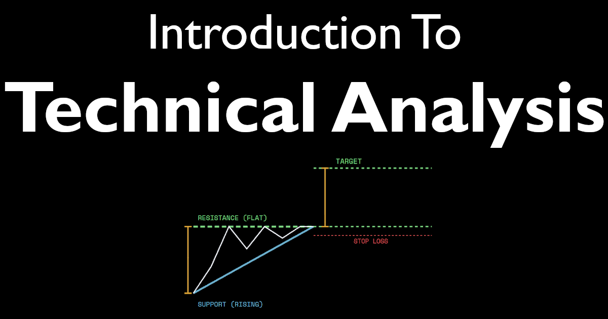
3. Triangle Patterns: How To Trade Consolidation Breakouts
Triangles (ascending, descending, and symmetrical) are consolidation patterns that form as price makes smaller and smaller swings, compressing into a tight range. Think of it as a coiled spring.

An ascending triangle has a flat top resistance line and a rising lower trendline. It signals that buyers are becoming increasingly aggressive (making higher lows) while sellers are holding firm at a fixed price. When buyers finally overpower that resistance level, the resulting breakout can be sharp. A descending triangle is the mirror image and tends to resolve to the downside. A symmetrical triangle reflects a standoff between buyers and sellers, with the breakout direction often following the prior trend.
The reason these patterns produce strong moves is partly mechanical. Stop-loss orders from traders who bet the wrong way get triggered as the price breaks out, adding fuel to the move. Momentum algorithms also pile in when a breakout is confirmed, creating a cascade effect. Our full guide on ascending, descending, and symmetrical triangles walks through specific entry and exit strategies.
3 Essential Technical Indicators for Beginners
Indicators are mathematical calculations applied to price and volume data. They don't predict the future. What they do is organize raw price data into a format that makes trends, momentum, and potential reversals easier to spot.
1. Moving Averages: How To Identify Trend Direction
A moving average smooths out daily price fluctuations to give you a cleaner picture of the underlying trend. The Simple Moving Average (SMA) calculates the average closing price over a set number of days. The Exponential Moving Average (EMA) gives more weight to recent prices, so it reacts faster to new price action.

The most common use case is trend identification. If price is consistently above its 50-day SMA, the trend is up. Traders also watch for moving average crossovers, such as when a shorter-term average crosses above a longer-term average, which can signal the beginning of a new uptrend. Moving averages also act as dynamic support and resistance levels. Many professional traders place stop-loss orders just below a key moving average because it's a commonly watched level. To understand the difference between SMA and EMA moving averages, please see our full article on the topic.
2. RSI: How To Spot Overbought and Oversold Conditions
The Relative Strength Index (RSI), developed by J. Welles Wilder and published in his 1978 book New Concepts in Technical Trading Systems, measures the speed and magnitude of recent price changes on a scale of 0 to 100. Readings above 70 are traditionally considered overbought, while readings below 30 are considered oversold.

The more nuanced use of RSI involves watching for divergences. If a stock makes a new price high but RSI makes a lower high, that divergence suggests momentum is weakening even though price is still rising, a potential early warning of a reversal. RSI is most reliable when used in combination with price patterns, rather than as a standalone signal. For an explanation on how to use the Relative Strength Index (RSI) to improve trade entries, please see our guide on the topic.
3. MACD: How To Identify Momentum Shifts and Trend Reversals
The Moving Average Convergence Divergence (MACD) indicator, created by Gerald Appel in the late 1970s, calculates the difference between two exponential moving averages and plots it alongside a signal line. When the MACD line crosses above the signal line, it suggests bullish momentum is building. When it crosses below, momentum may be shifting to the downside.
The histogram, which displays the gap between the MACD line and signal line, is particularly useful. A growing histogram confirms momentum in the current direction, and a shrinking histogram indicates the opposite. Like RSI, MACD is most powerful when it confirms what you're already seeing in the price action and chart patterns.
How To Practice Technical Analysis for the First Time on the Simulator
Reading about technical analysis is a start. Actually making trading decisions based on it is where the real learning happens. Here's a structured assignment for first-time traders using the Trading Blitz simulator.
The assignment is inspired by the classic price action trading approach taught by Al Brooks, a professional trader and author of the widely respected Trading Price Action series. Brooks emphasizes making decisions based on what price is doing right now, in context with the overall trend structure, without overcomplicating things with too many indicators.
Your First Assignment: 5 Steps To Read a Chart From Scratch
- Reset Game History in Dashboard to ensure you're not including old data in your results.
- Identify the trend. Load a new chart on Trading Blitz. Before touching any indicators, look at the price bars. Is price making higher highs and higher lows (uptrend), lower highs and lower lows (downtrend), or neither (sideways)? Write your assessment in the Notes section of the simulator before moving on.
- Mark your support and resistance levels. Find the most obvious price levels where price reversed multiple times. Draw a horizontal line at each one. These are your key battlegrounds.
- Add one moving average. Apply a 20-day EMA to the chart. Is price consistently above or below it? Does price bounce off it on pullbacks? This gives you a dynamic sense of trend direction.
- Check RSI for confirmation. Add RSI to the chart. If the trend is up and RSI is pulling back toward 40-50 (rather than collapsing below 30), that's a sign the uptrend is healthy. If RSI keeps failing below 60 on rallies, the trend may be weaker than it looks.
- Look for a pattern and make a trade. Using what you've observed about trend, key levels, and momentum, look for a consolidation near support in an uptrend, or a breakdown through resistance in a downtrend. Place a virtual trade with a stop loss below your key support level and a target at the next resistance level. Click "Next Day" and track your result.

Do this with ten different charts. Don't worry about being right every time. Focus on following the same process each time. Pattern recognition is a skill built through repetition, and the simulator lets you get years of chart-reading experience in a fraction of the time it would take in real markets.
Free Cash-Prize Tournaments
We run free cash-prize tournaments (no entry fee required) when we go live on YouTube. Be sure to subscribe to our channel - @TradingBlitzSimulator - to get alerted when we go live next.
Citations
- Dow, Charles H. The Wall Street Journal editorials, 1900-1902.
- Edwards, Robert D., and John Magee. Technical Analysis of Stock Trends. 1948.
- Wilder, J. Welles. New Concepts in Technical Trading Systems. 1978.
- Lo, Andrew W., Harry Mamaysky, and Jiang Wang. "Foundations of Technical Analysis: Computational Algorithms, Statistical Inference, and Empirical Implementation." Journal of Finance, Vol. 55, No. 4, August 2000.
- Brooks, Al. Trading Price Action Trends. Wiley, 2012.
- Appel, Gerald. Technical Analysis: Power Tools for Active Investors. FT Press, 2005.
Disclaimer: The content published on Trading Blitz, including this article, is provided for educational and informational purposes only. Nothing contained herein constitutes financial advice, investment advice, trading advice, or any other type of advice. Trading Blitz is a simulation platform intended to help users learn and practice technical analysis concepts using historical data in a risk-free environment. All trading involves substantial risk of loss, and past performance, whether in a simulator or in live markets, does not guarantee future results. You should consult a qualified financial professional before making any real investment or trading decisions. By using Trading Blitz, you agree to our Terms of Service. For additional information, please see our Terms of Service.
Affiliate Disclosure: Some content on Trading Blitz may include affiliate links. If you click an affiliate link and make a purchase, we may earn a commission. This does not affect the price you pay.